In our Intro to this bootcamp, we talked a little about the very 'springness' of spring - the sights, the clues, the colours that show up in our images and loudly shout about Spring.
And it's the colour of spring that we will begin with. Today, we are setting out on a colour chase and we are going to try and learn to see the colour relationships and how they can help you create stronger images.
The Colour Wheel
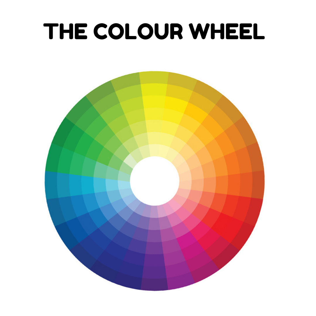
This is a colour wheel. It represents colour groups visible to the human eye spectrum. But it also helps us work with colour in a way that best brings out their unique qualities. We can use the wheel to help us find colours that will compliment or contrast with one another.
Colour theory, which is what helps us work with colour, is quite a complex set of ideas and it takes photographers who are keen to work with colour thoughtfully, a long time to put them in practice. But we can certainly make a start to create stronger images and I'll show you a few ways with colour that can help here:
Make something stand out with colour :
We can use colour to make one element stand out amongst the others and there are several ways of achieving that.
- warm vs cool colours
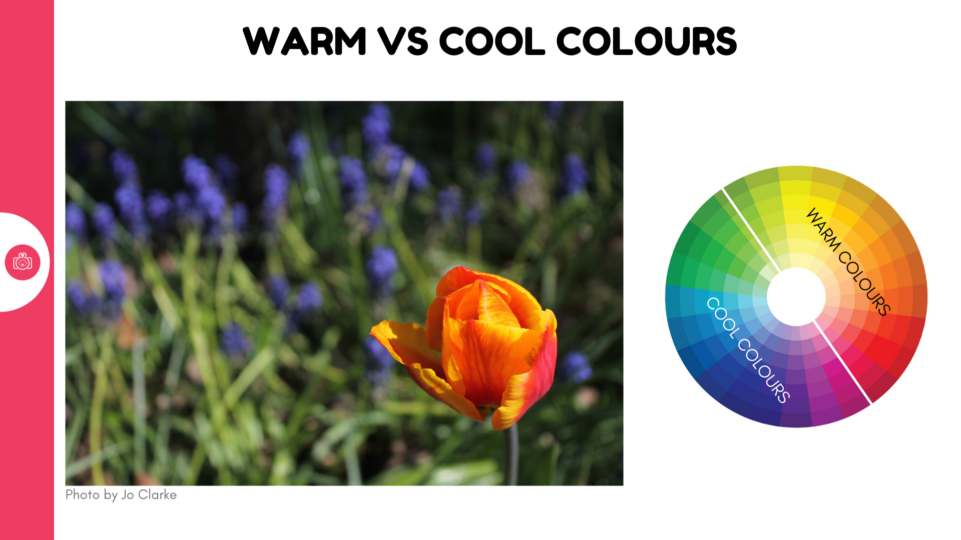
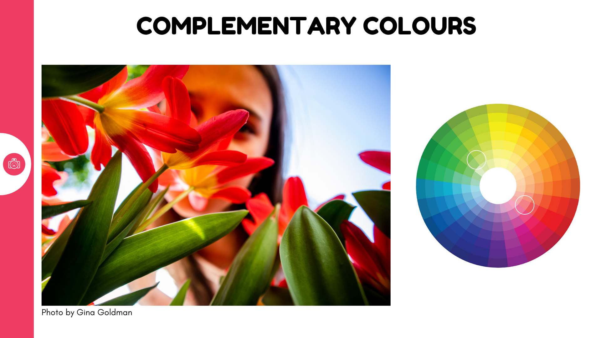
Warm, saturated colours like reds, oranges, yellows will always draw the eye more towards that element than even similarily bold, but cooler colour. So our orange tulips stand out against the cool green of the stems and leaves and cool blue of the sky beautifully, even if the green and the blue are just as bright! This is why I like to dress my kids in something red or yellow if I know we're off to the woods as I know we will be set against a whole wall of green.
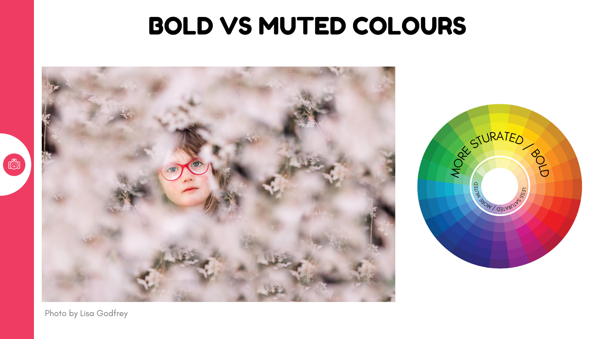
- bold vs pastel colours , bright vs dark
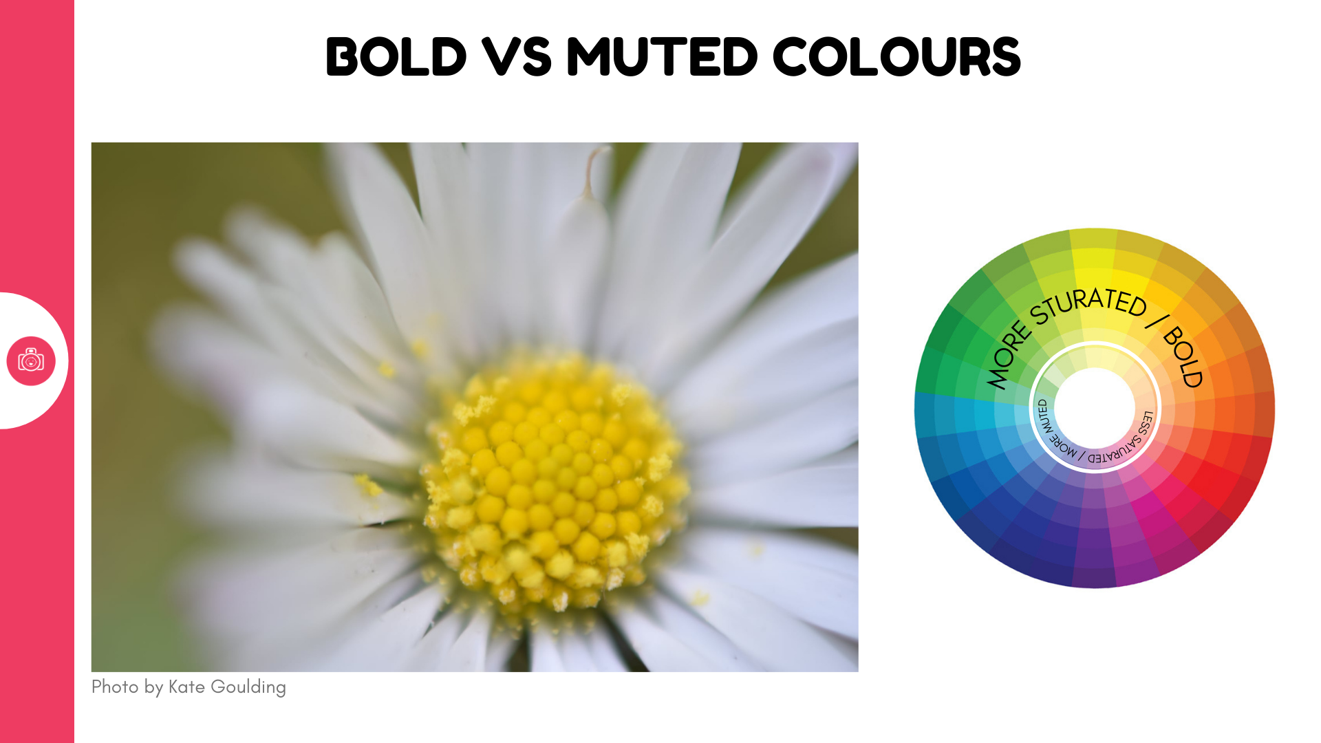
I say 'bold' and 'pastel' but what I actually mean is that these colours differ in saturation. Imagine saturation like this - picture a bucket filled with red paint - if all you're seeing is big bold red, that's a bucket filled with pure red pigment = highly saturated. Now picture a bucket filled mostly with white paint with just a dash of red pigment added and mixed into it. It produces a lightly coloured result - a pastel if you will = low saturation.
Setting a bold colour against a more saturated one will always result in the bolder colour standing out more. So if you want to bring attention to flowers your child is holding, consider dressing them up in something that doesn't command as much attention.
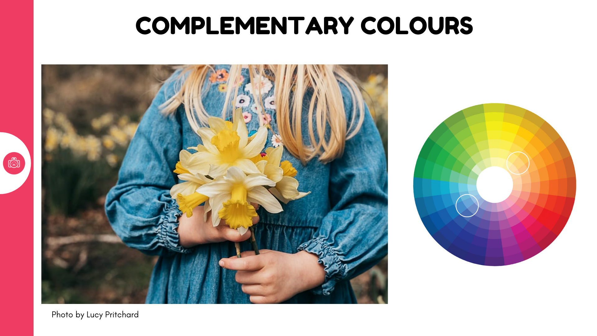
- Complementary colours
Complementary colours is a confusing way of saying ' contrasting colours that sit on the opposite ends of the colour wheel. So we're talking setting green against red, blue against orange, yellow against indigo. The idea is that these colours have a similar visual weight and can balance each other well, creating a pleasing contrast.
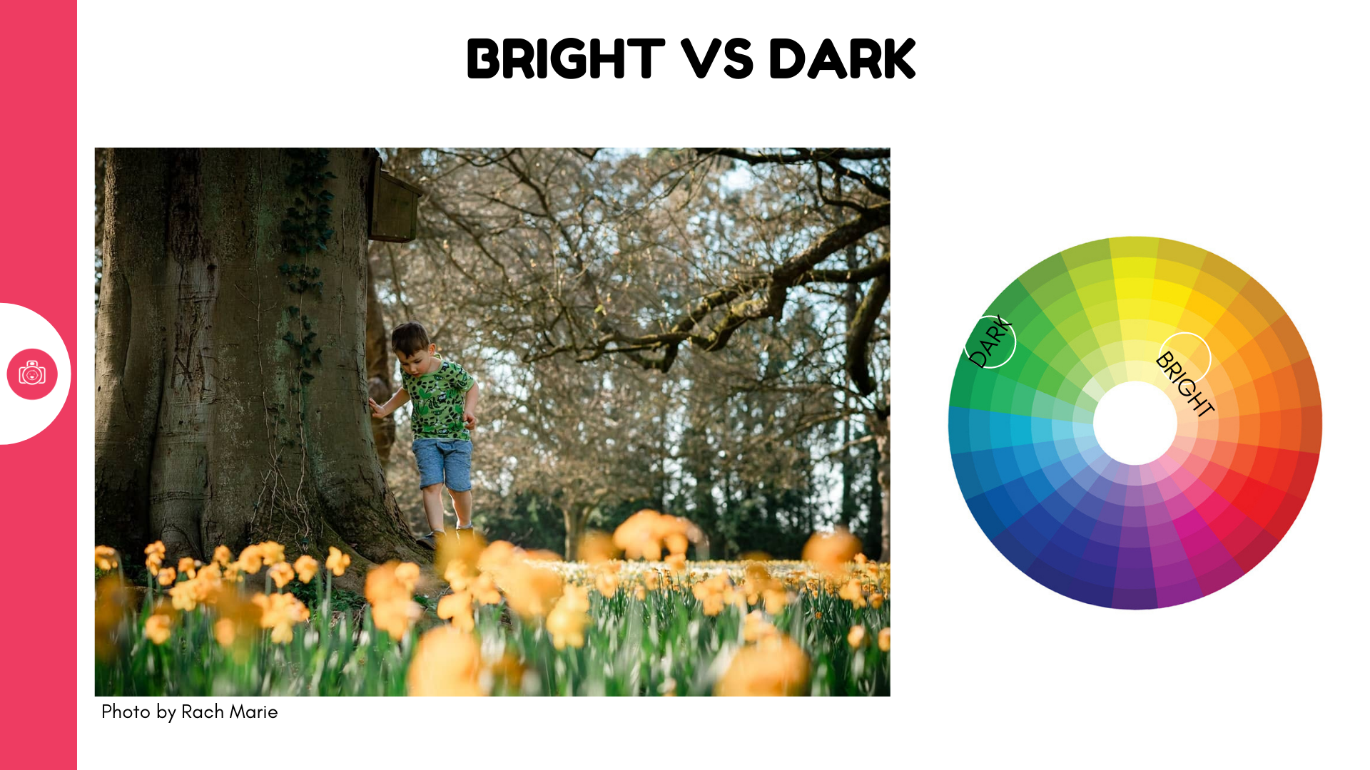
- Bright vs dark
Our eyes are conditioned to go to whatever is brighter in the image, so by setting a brighter colour against a darker one, we can again make the brighter one sing louder.
Use colour as a backdrop
Spring spoils us with virtual carpets of colour that we can feast our eyes on. This is where you often want to really highlight just that, without distracting from the mass of flowers or other elements. To highlight them best, they should be paired with something that is either similar in colour, similar in visual impact, or has little disruptive power
- match with similar / analoguous colours
I'm not talking about dressing your child to camouflage them among the foliage, but simply to pick colours similar to what's already in there - a different saturation or brightness of the colour provided by nature can really tie the whole thing together. This is where the knowledge and use of analogous colours can really come in useful.
Analoguoyus coliurs are those that sit next to one another on the colour wheel. They can promote a sense of harmony in an image because they are not competing for attention with the backkdrop
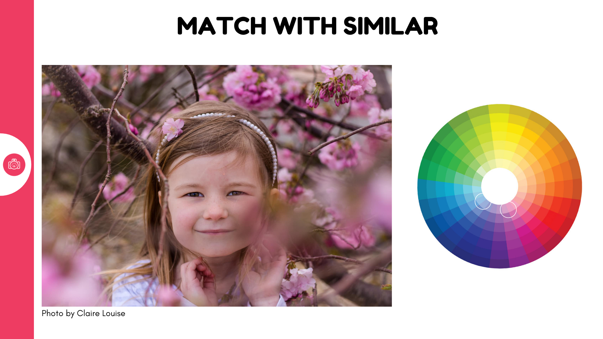
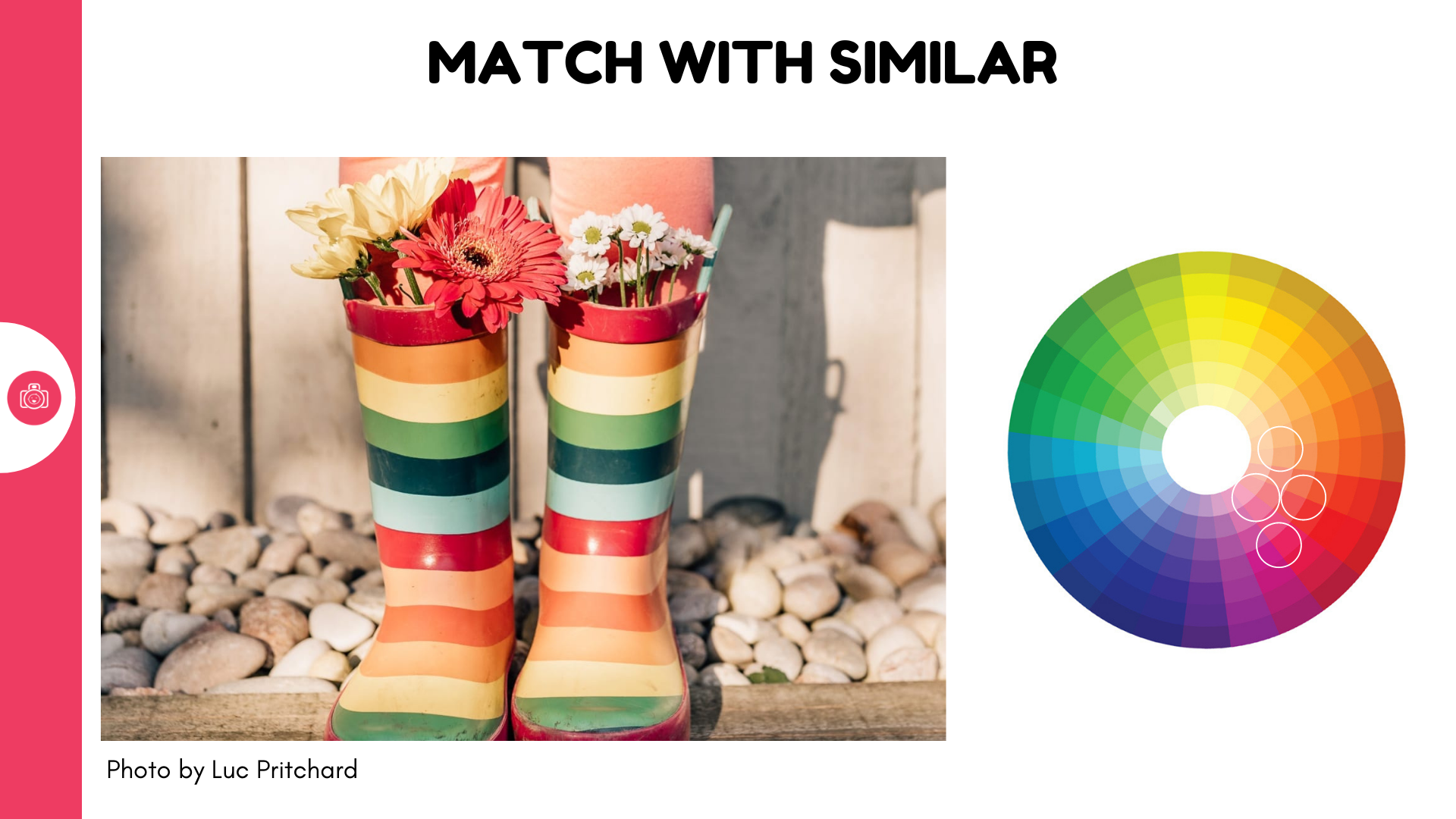
- match with similarily saturated colours
Think trying to highlight pastel hues - if you match them with something bolder, it'll distract the attention from the delicata balance of light and colours. But getting a similarily light coloured colour to match with it, promotes a harmonious colour match.
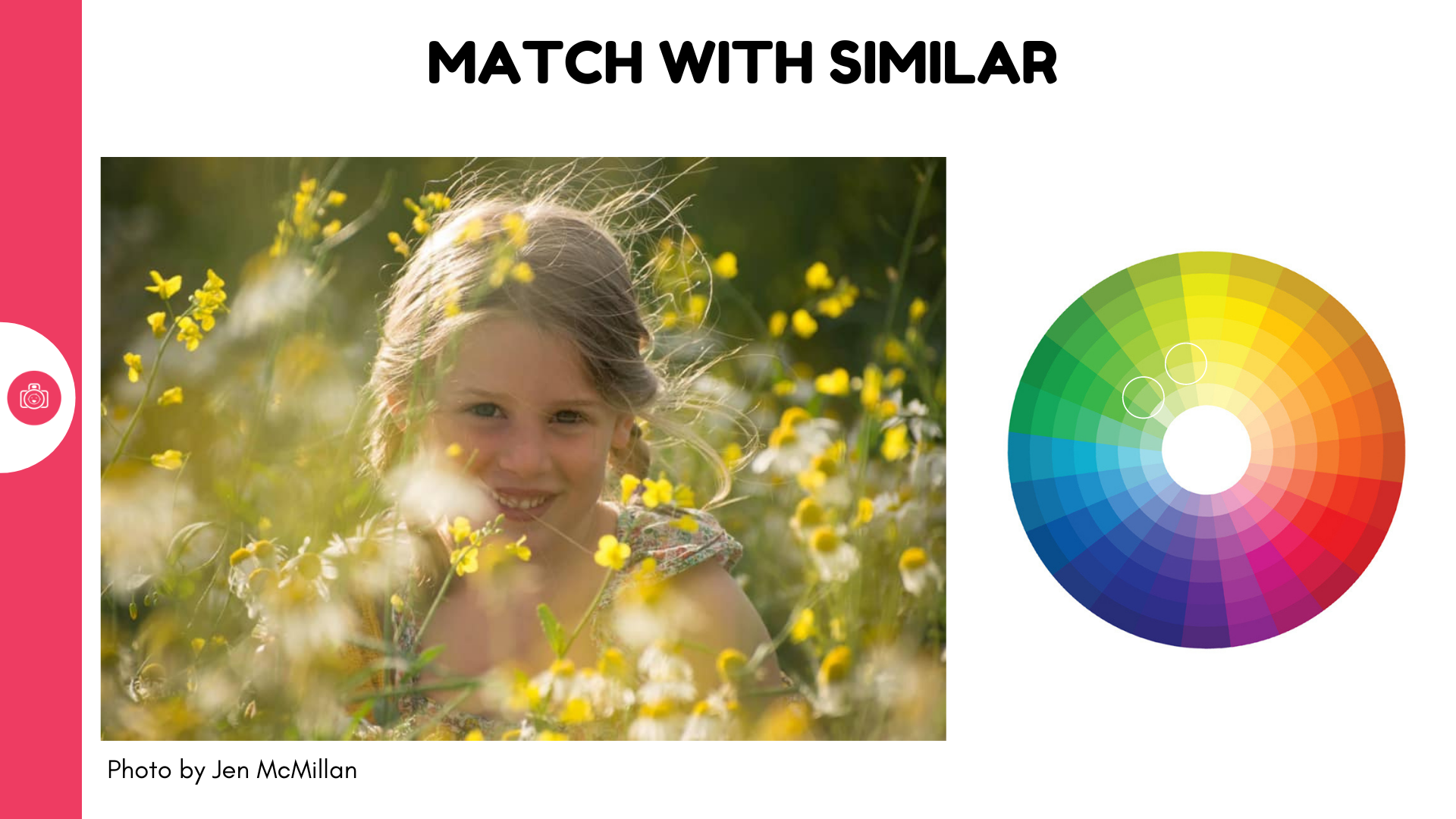
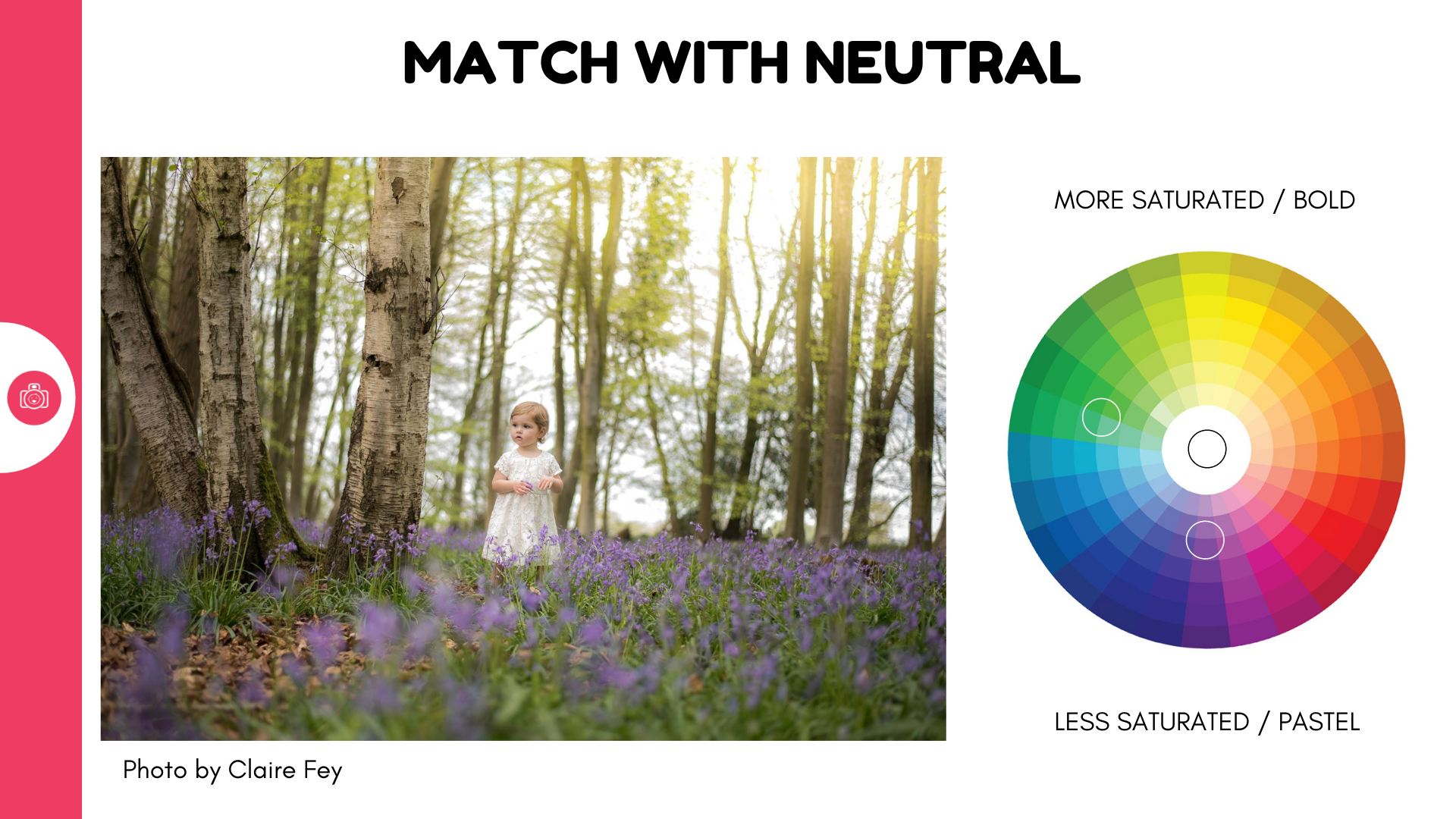
- match with neutrals
White, cream, grey, charcoal and black are all neutrals - they have little by way of any colour to themselves which means they go with anything and everything. Using neutrals with maybe a hint of colour in accessories is an easy way to keep the eye on the surrounding colour. White and creat works especially well as it's bright enough to still bring the eye to your subject, but the lack of colour impact makes it easy for your subject to blend into the image.
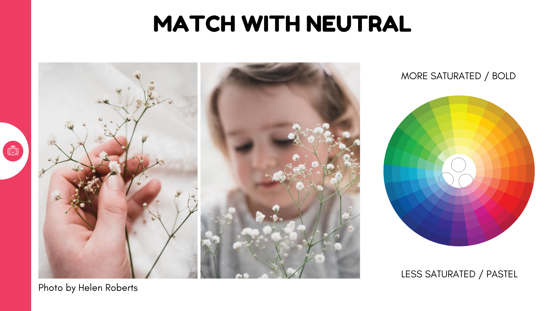
Triad colours
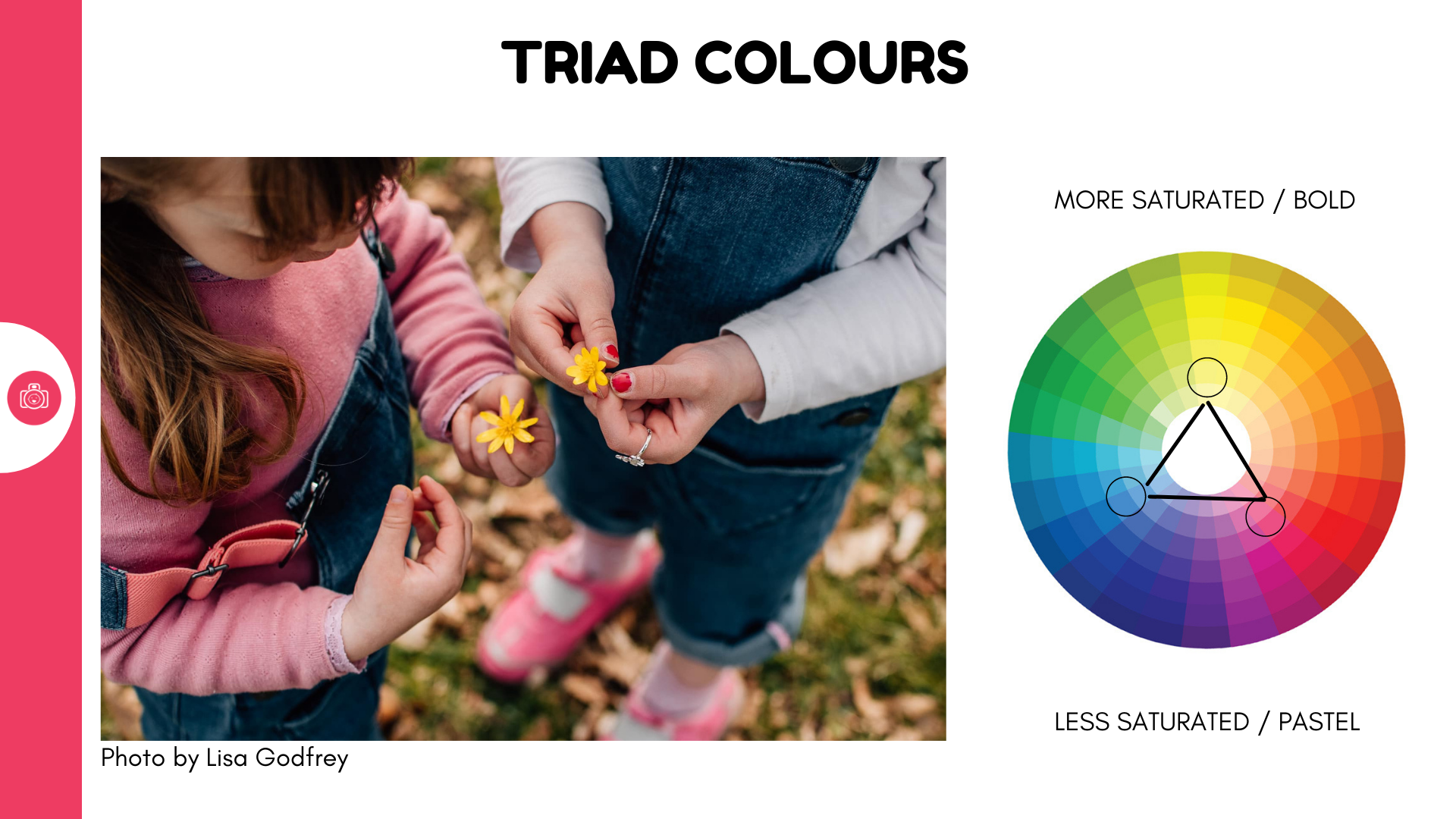
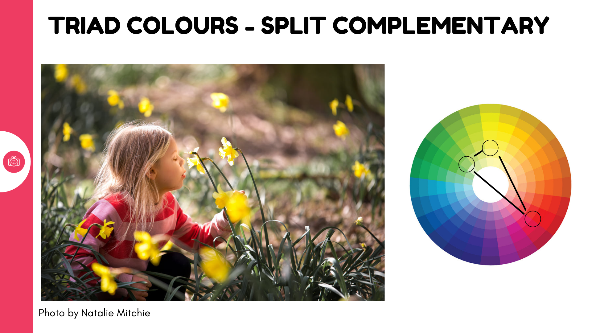
The final concept is a little trickier as it involves paying attention to not 2 but 3 colours at the same time. The idea is that if you pick 3 colours that are similarly spaced from one another on the colour wheel ( effectively creating triangle with equidistant sides, those three colours will balance each other out really well. Another version of the same concept is called split complementary colours and then we take two colours from one end of the wheel and balance it with one colour on the other side.
Again, we're not going for perfection, but for conceptualising what is likely to be a good match. SO for instance, if you're off to take photos of bluebells ( which confusingly are more of a purplish blue) in amongst all green of the woods consider using a hint of red on your child as it will act as a counterbalance for the nature colours.
Challenging aspects
I know people tend to get stressed when we talk colour in photography and immediately start scanning their children's wardrobes, feeling annoyed for past child wardrobe purchases. Why did I get green wellies!? Why did I think orange and brown coat is a good idea! My child dressed themselves and is currently wearing EVERY colour.
Listen, It's OK. My two kids have always insisted on dressing themselves and usually it's a riot of mismatched patterns and colours or 70 shades of pink. And especially for the everyday photos, I don't interfere, I don't make them change - life is life and I like my photos to be truly grounded in who my children are rather than a magazine version of their lives.
But for those more special photos, where I know I will be surrounded by colour, I do steer them towards those outfits that are more likely to work well. That Peppa pig jumper? Sorry, it's in the wash. Suuuure, you can eat that melty chocolate ice cream in your big logo tshirt...
I might also consider the context when buying clothes - for my youngest, I will often go for bright colours like red or yellow coats / wellies etc as I know they'll photograph well on our walks.
Sometimes, just an accent colour on one item - yellow wellies, red hat, pink sunnies - will be enough to tie an image together.
Which is all a long winded way of saying this : if you can control your kids wardrobe and use colours that will work great for your images - do. If you can't - accessorise boldly or use neutrals. And if accessorising is not possible - just embrace the chaos! We will be showing you how to use other ways to strengthen your images beyond colour, so not all hinges on your kids wardrobes!
Day 1 Challenge
Now that you know what to look for in spring colours, I would like you to try capturing an image illustrating at least 1 of the colour relationship concepts. That's the minimum. If you're feeling up for it, try capturing other images, illustrating the other ones:
concept 1 - colour contrast to make your subject stand out
concept 2 - colour harmony to create calm balance
concept 3 - triad of colour
Use the colour wheel to help you!
Don't forget to post your images to our Facebook group!!
