How to photograph an autumnal
flat lay
Do you find yourself always fishing out stray sticks, pebbled, dried up leaves and other treasures out of your pockets or bag? Can you walk by a pretty leaf and simply feel you need to pick it up?
If so, my friend - this is for you. Because today we are exploring a way of displaying and capturing all those treasures - we're creating Flat Lays
What's a Flat Lay?
You have absolutely seen them before, but maybe just didn't know the name. It's a way of shooting where you place your camera above a surface and shoot pointing down . The resulting image is purposefully 2 dimensional because it relies on colours, textures, shapes and arrangement to look great
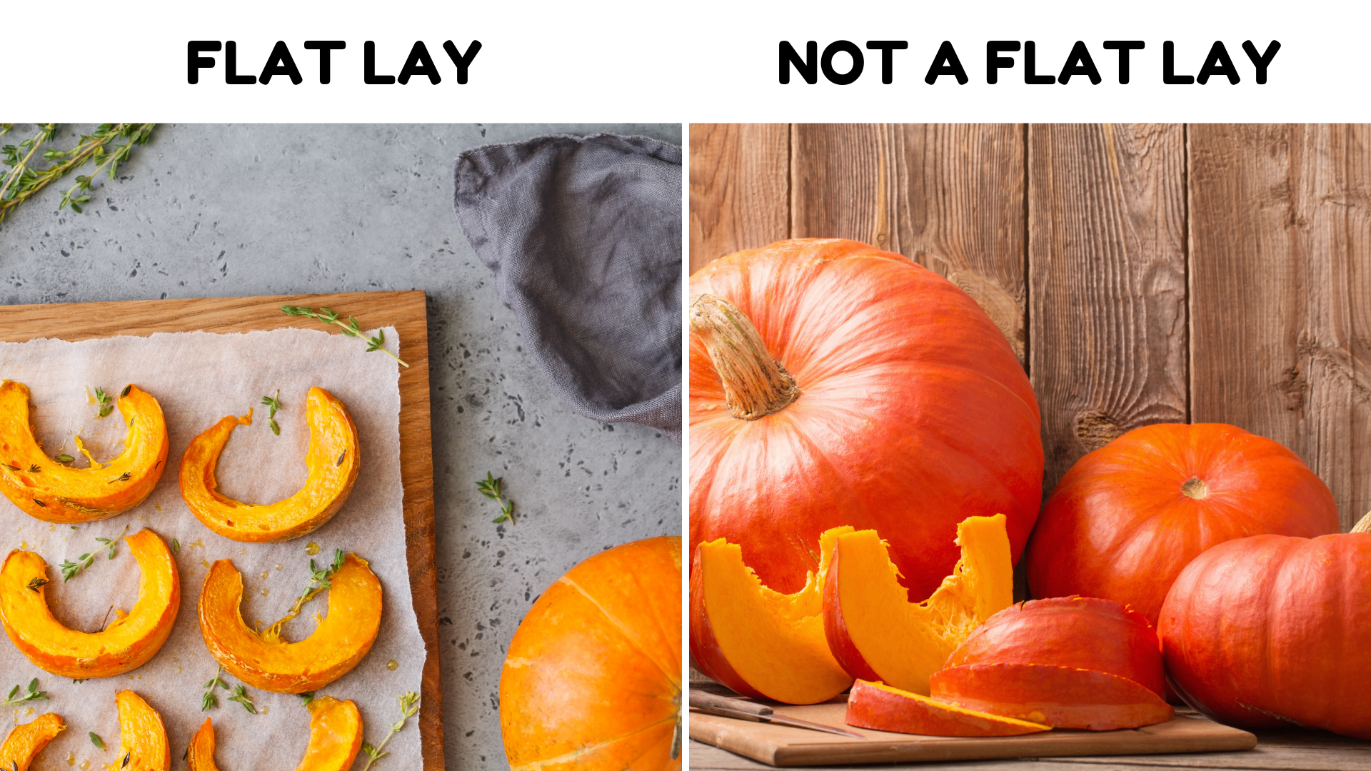
And since autumnal treasures are a lot about the colours, the shapes and the textures, a flat lay is a perfect way to capture and display them. And we're here to help you do it well.
So here are out top tips for creating a beautiful flat lay:
1. The light
It matters - A LOT here. Since we're after a 2 dimensional image - so an image where the height and depth don't matter , we need to remove those as a factor from your photo. This is why you want a gentle, soft light which will create minimal shadows. Natural light is best for this.
Don't feel disheartened if you haven't got a table positioned helpfully by a large window - place your treasures on a portable surface and put them next to an open door etc - you will be shooting from above so this will actually not matter that much and you can compose and crop your image in a way that anything beyond the intended target is cropped out.
Depending on how soft or harsh your light is, you may also want to consider placing a reflector ( I use a simple foamboard, but any white surface, even a white tshirt stretched over a piece of cardboard - will do
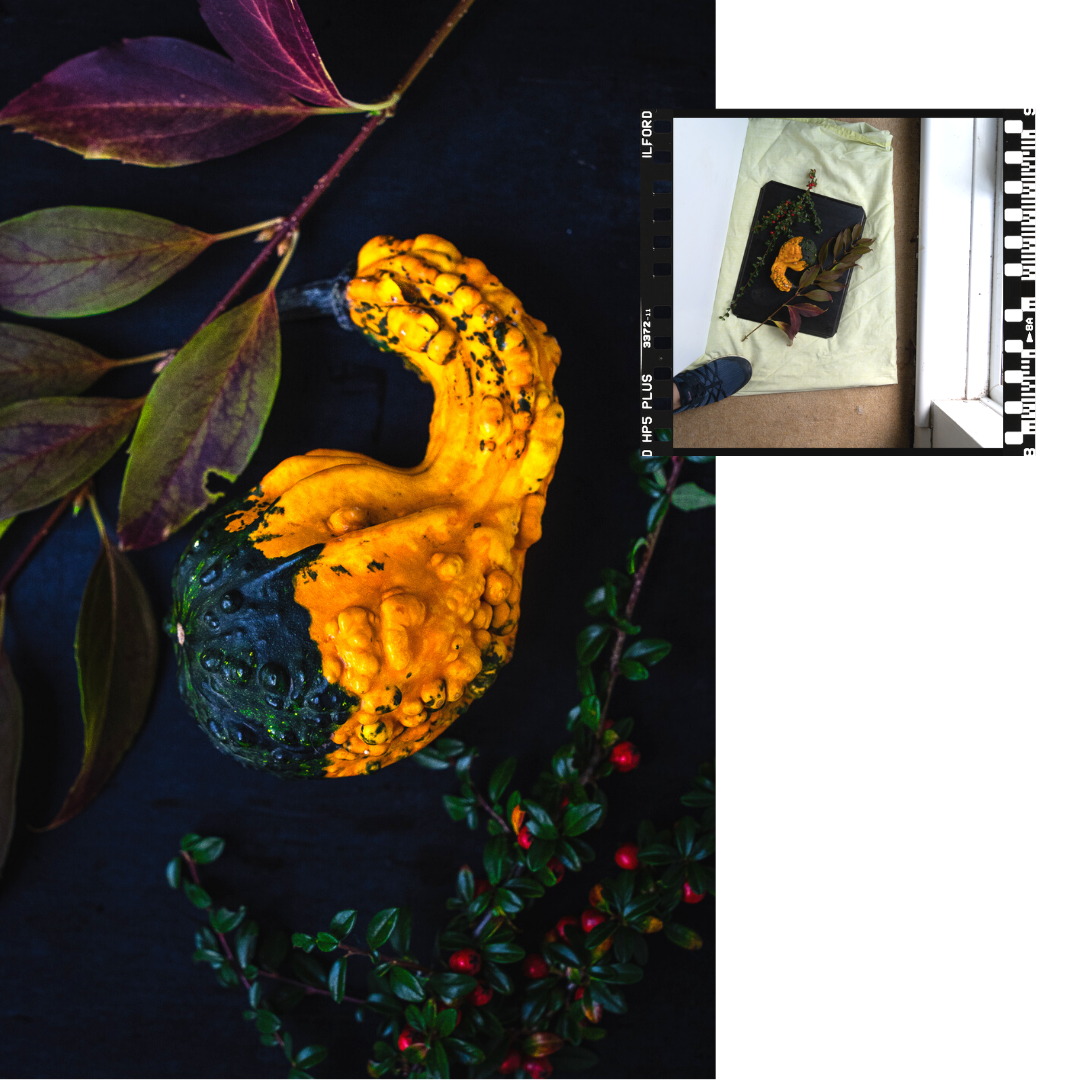
2. Your angle
I'm going to be very very clear here - the only acceptable angle for a flat lay is the straight down, 90 degrees to the surface or bust.
Here is why - we are again coming back to the principle of the flat lay which that the height and depth don't matter. The moment that your angle goes a little skew-ish, you are starting to show or at least hint of the height of things and the perception of the image changes. Don't get me wrong, I am not telling you to not take the type of photos that show height and depth - far from it! But today, it's all about flat flat flat.
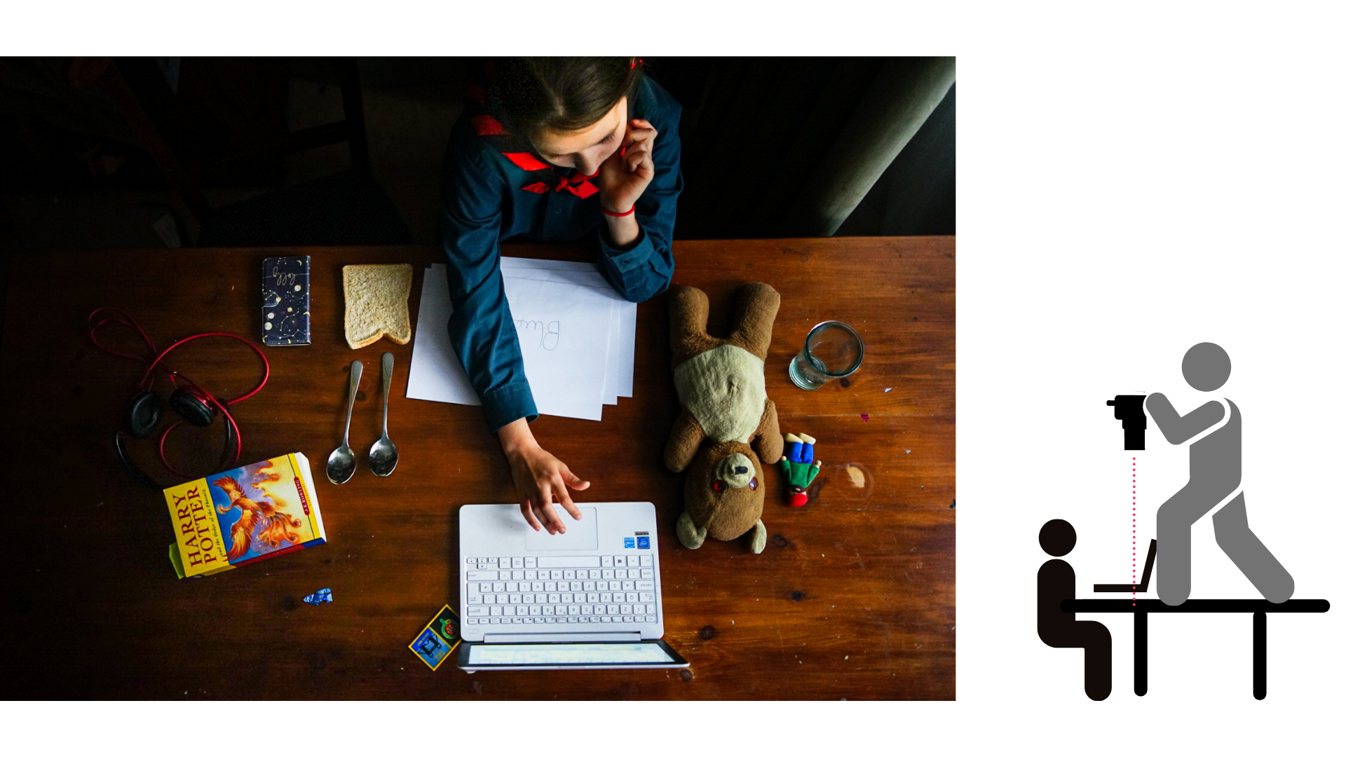
This means that of you're going to shoot above your subject, you need to get way above. My family is pretty used to me standing on the table above them as they calmly eat their soup - but a) we have a very very sturdy table, I usually have someone ready to catch or steady me if I wobble.
SAFETY FIRST - I repeat - SAFETY FIRST.
Go above only if you are confident you and your family are safe. That's also why I like shooting flat lays on the floor, smaller distance to fall. A tripod is your best friend - again - safety first, those things can topple.
If you are shooting above a table ( because maybe you want to take a photo of your kids doing something on that surface), find something sturdy to stand on and someone to lean on.
And for the love that all is holy to you, either make sure that the camera strap is hang on your next or the camera is otherwise secured. You really don't want it to smash onto the table or your child's head.
3. Your lens and camera settings
If you're shooting with your phone, scroll on - this will not really apply to you here because the lenses on your phone are different to what we have on the camera-cameras.
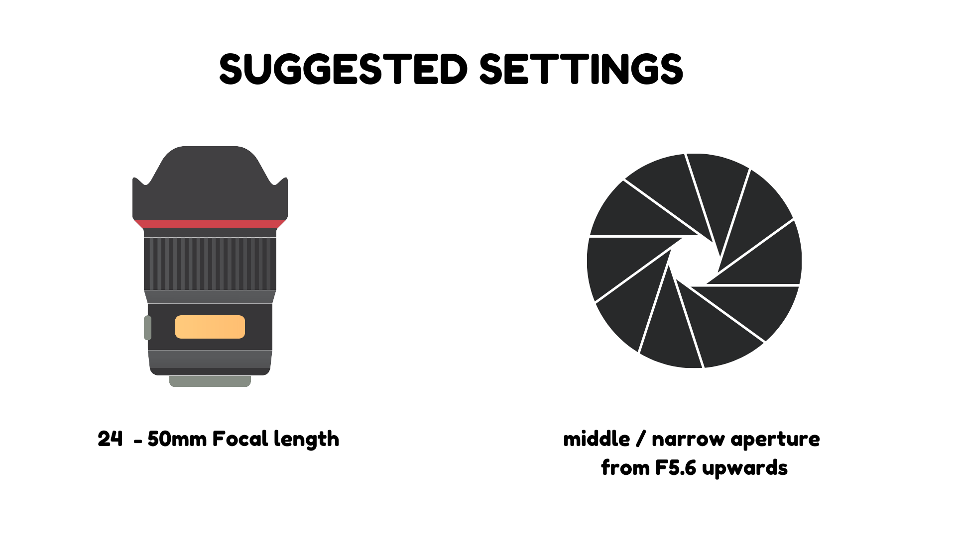
If you are shooting with a camera, here is an important tip. Since we're shooting from above the subject, the temptation is to use your shortest available focal length ( because it allows you to grab a wider view at a shorter distance). I'm here to tell you that for some compositions, especially if you're incorporating humans who may be higher than the rest of the scene ( like your kids arranging the leaves etc), the short focal length may cause size distortion and make their head appear larger than they actually are ( it's just how short focal lengths work up close). So in that instance, you want to use a longer focal length ( aka - zoom a bit - not a lot - 24mm, 35mm or 50mm if you can go that high) to ensure the proportions work well. If your flat lay elements are just mainly flat, it doesn't really matter too much, the distortion will not be visible.
Speaking of cameras - your settings matter too if you have elements at different heights. If you're normally shooting wide open ( aka at the widest apertures) this is the time to break into those middle apertures. I like to use F8 to ensure my area of sharp focus is large enough, especially since my shutter speed matters less here as my subjects are less likely to run away)
4. Your surface / background
The beauty of shooting flat lays is that you only need to clear a small portion of the space for the photo. There may be piles of toys directly next to it and noone would be the wiser. Certainly a bonus in my house!
Secondly, just because you artfully arranged your items on an offcut of a floor plank, nobody needs to know!
Some tips for picking the right surface / background:
- nothing shiny - the glare can be distracting and you can also end up with unwanted reflections.
- natural wood, stone, slate, tile, marble ( or let's face it - marble effect stuff) or even metal ( l love a good battered and blackened baking tray) tend to work well as a reasonably neutral background
- good quality fabrics - cotton and linen - can add a great texture to the background. You can use them on the whole are or to section off a portion of it. TOP TIP - iron is your friend here. I barely iron anything these days, but when I shoot flatlays, I will either go for the artfully crumpled look or properly flat and ironed. Otherwise the small wrinkles do distract
- paper or foamboard - both work great because they are mostly matte ( if very slightly reflective).
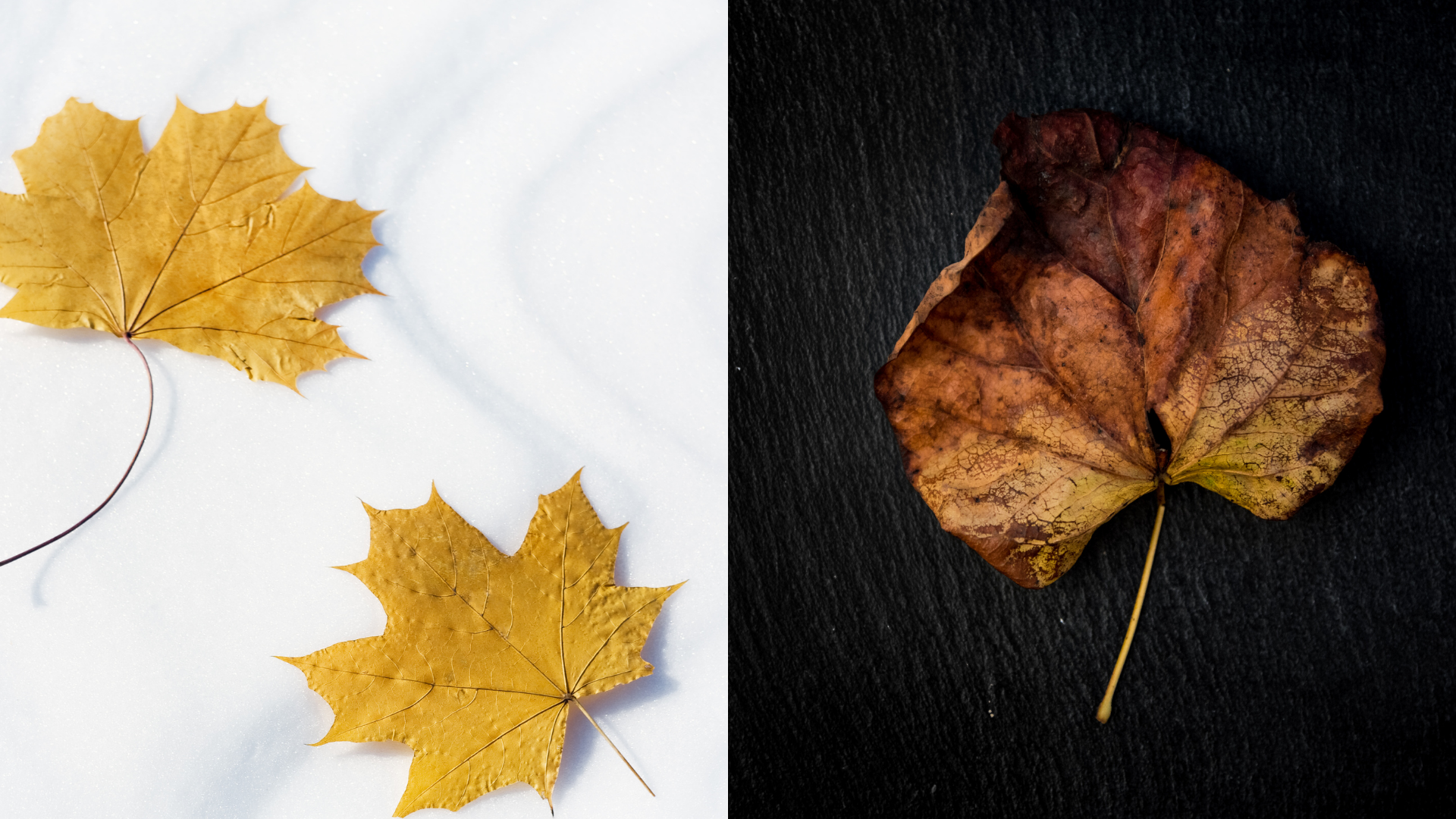
Keep in mind that bright surfaces will reflect light and dark surfaces will absorb it. Both can create a very different outcome for the same objects with the same arrangement, so it's good to try a few ways with it before you settle on one. Also - strongly coloured surfaces will cast colour on the subjects placed on top, especially if they have a lighter colour.
5. Colours
Colours in a flat lay arrangement should be used thoughtfully - after all, they are a big part of the composition.
Using colour is such a vast area and I really cannot be prescriptive here, but here are a few things that you may want to keep in mind
- pop of colour / colour contrast : using bright saturated colours to stand up against the background. You typically don't want to have more than 3 colours in this kind of scenario.
- variations of the same colour space : picking items which sit close to one another on the colour wheel so for instance placing yellow next to orange, next to red and brown
- pastels, neutrals - nothing dominates, the composition relies more on shapes and textures than colours
- adding a visual relief colour - sometimes, especially when the majority of the composition is mainly similar muted colours, adding an accent that has an opposing colour ( like a green branch to predominantly brown scene or a few red berries
- colour repetition - using the same colour in a few incarnations throughout the composition - for example a red apple and a red ribbon and a few red scattered small berries
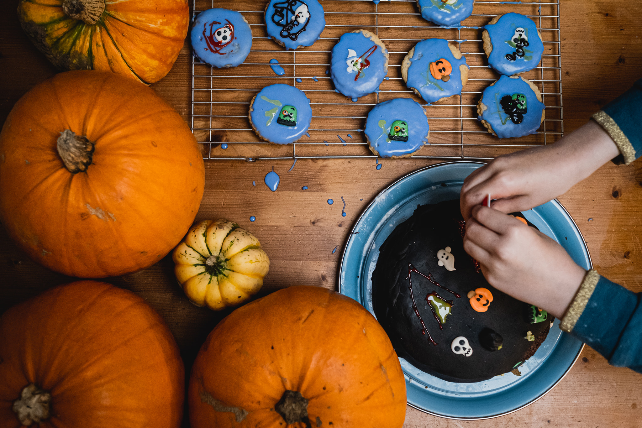
Photo by Morgan Wallace
6. Accessories
This is the additional items you choose ( or not - there is nothing to say that you must!) to style your flatlay with. And they should all be items that either
- add to the narrative of your story ( egg shells on the side when taking a photo of making a cake batter)
- hint at the process ( scissors and ribbons, and cut off of things)
- hint at an action ( a knife or spoon next to the pumpkin ready for the carving)
- show the hero item at a different stage ( berries next to a jam jar with freshly made jam spread onto some toast)
- are a different version of the hero item ( pumpkin biscuits next to actual pumpkins)
- add a contrasting texture ( twine or crumpled up tissue paper to create varied textures)
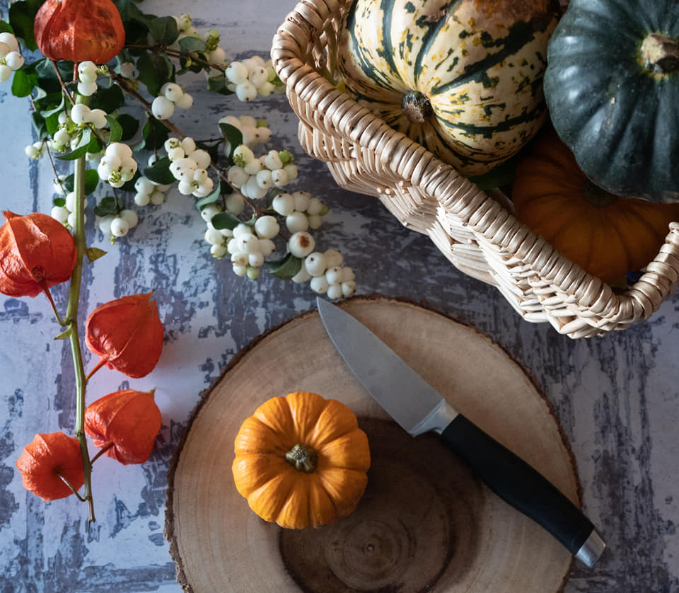
Photo by Jo Payne
7. To human or not to human?
Some flat lay arrangements are fine with just the items on their own. But sometimes, adding a human element can elevate an otherwise static image to something more.
This could be just a wider view showing your children from above as they're doing their thing or it could be just a little hand reaching for a biscuit. It's a different way of including someone in a way that tells us of their presence and what's going on, but at the same time keeps the focus on the items.
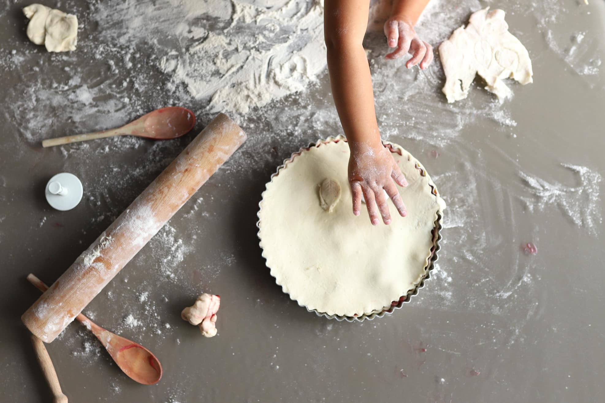
Photo by Becca Geddes
8. Using shapes
Since using depth and height is out of question, we use shapes and colours to organise the way the viewers eye takes in the image. And it's not just the shape of the 'items' that I'm talking about but using circles / rectangles / triangles to space-block the area of the image and visually 'layer' the items that way. Have a play with including the shapes whole as well as cropping into them.
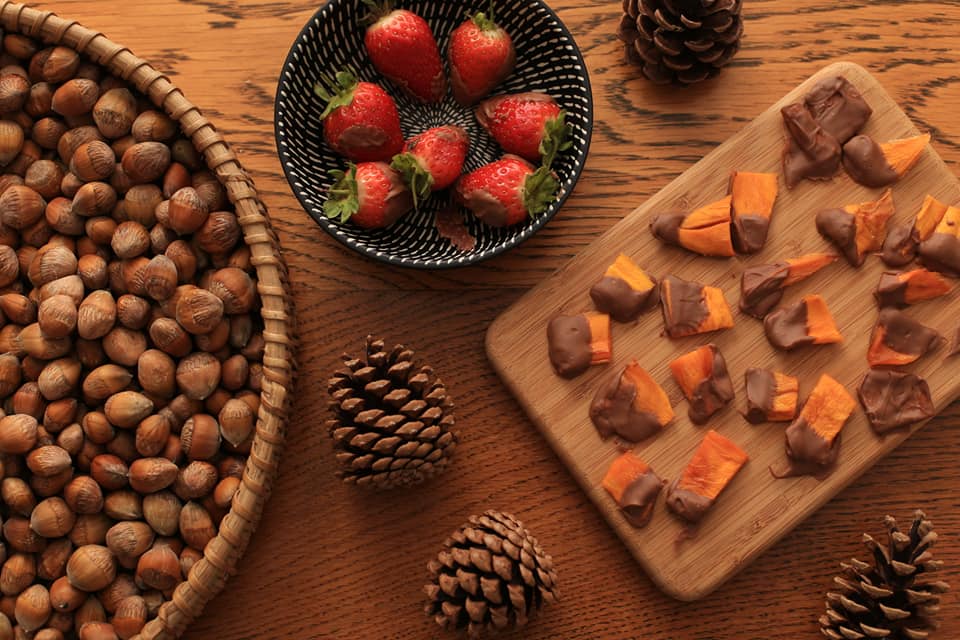
Photo by Sarah Gannon
Arranging your items
There are infinite ways of taking a bunch of items and arranging them in a way that's pleasing to the eye. I couldn't possibly list them all or tell you to specifically avoid doing something. But, when you're just not sure where to start, and artfully scattering the items on your surface from above is not bringing the desired effects, I'll give you a couple of ideas to kick you off.
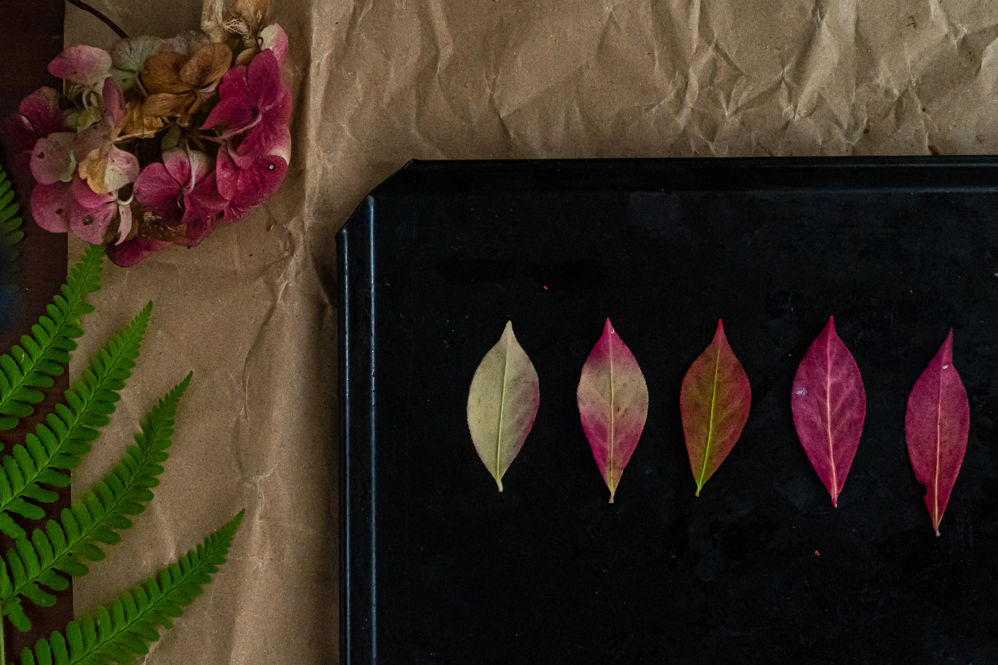
1. Minimalistic - exploring colour change through leaves
Take the same shape of a leaf and arrange it in the order of the colour changing so it looks like a life-cycle of a leaf. Keep the composition simple to focus the attention of the design rather than any styling distractions. Pick a background that will best contrast with the changing colours. The colour is repeated in the flower positioned off centre and we get a little relief from the green leaf on the side.
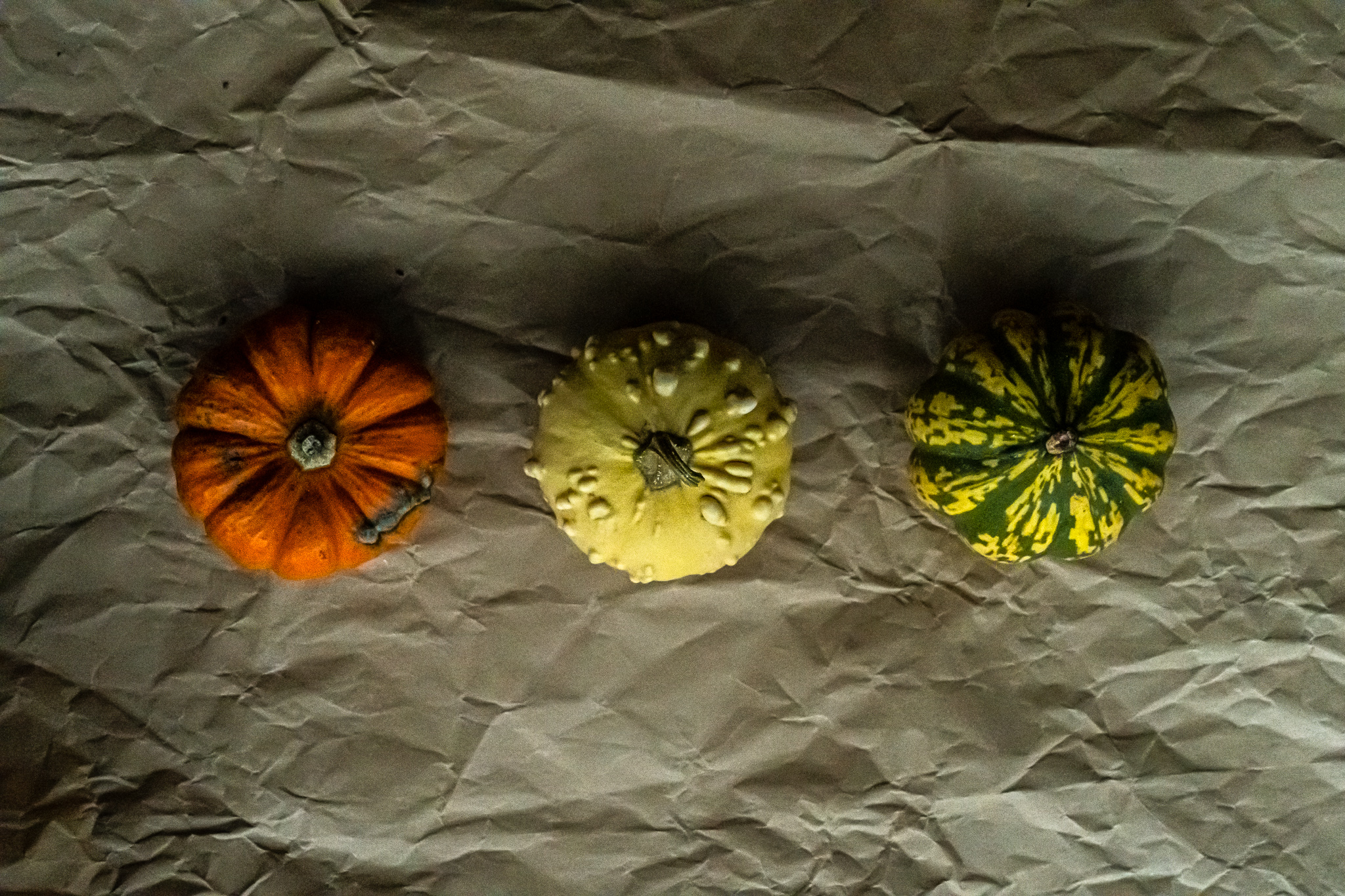
2. Repetition and Symmetry
I picked 3 objects which look similar and belong to the same 'kind' and yet are different. The simple juxtaposition of the slightly different shapes and a textured background which creates a mood but doesn't overtake the attention make it clear what the 'story' here.
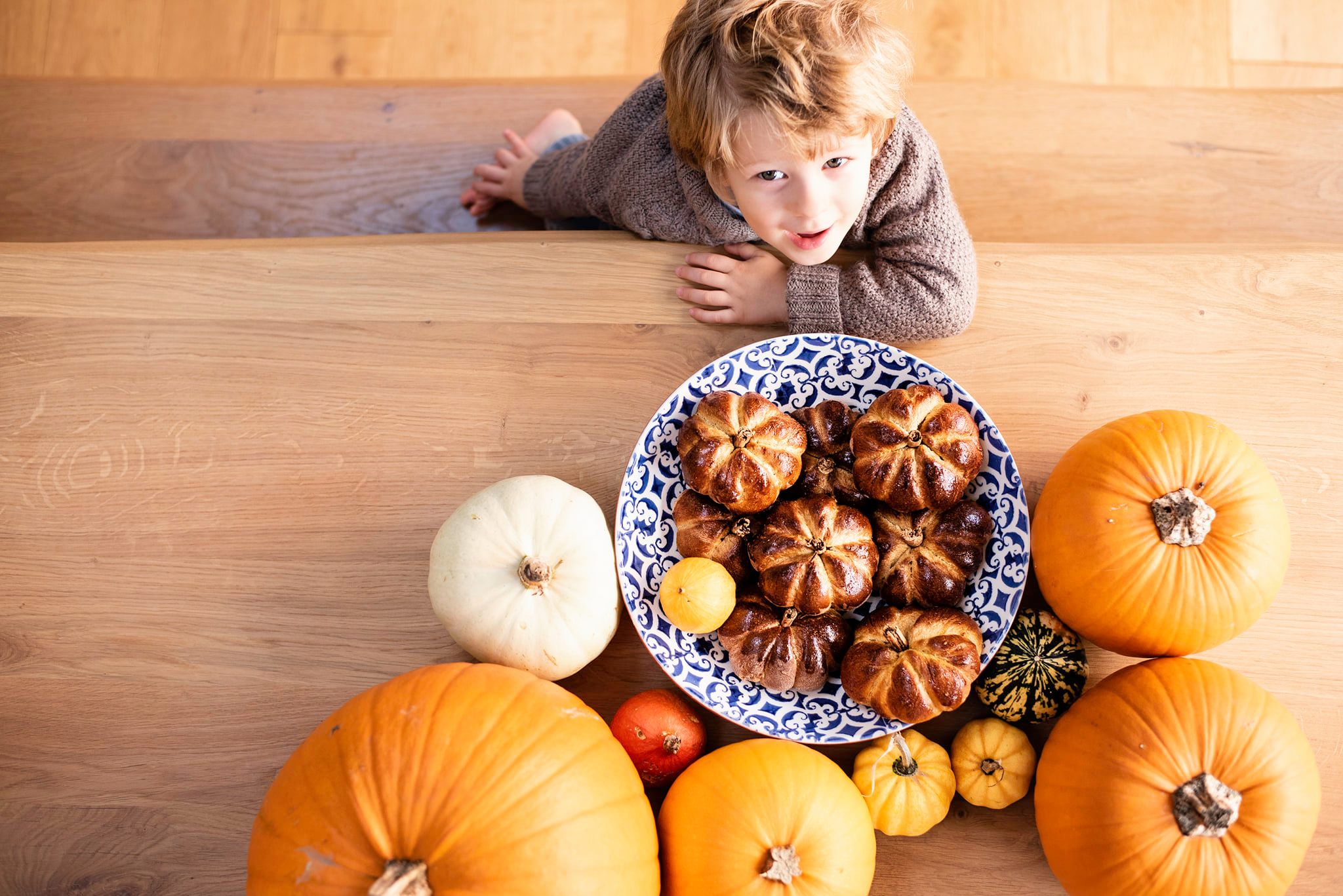
Here is another example of repetition - things that are almost alike! Real pumpkins and pumpkin pastries! Lots of repeating circular pattern as well. This image is by one of our grads Diana Chende
3. Rainbow or mandala
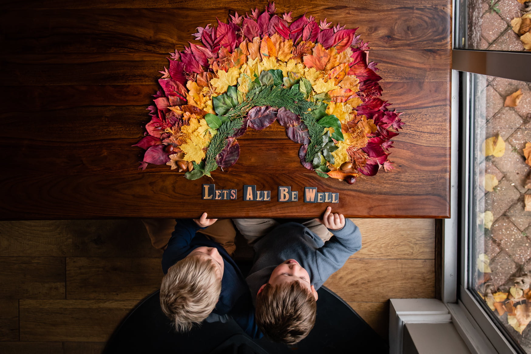
Another way that celebrates the colours of your objects is a rainbow or a mandala ( or another design you can make with your wares. Here our grad Ronnie Evans incorporated an uplifting message as well.
5.Framed
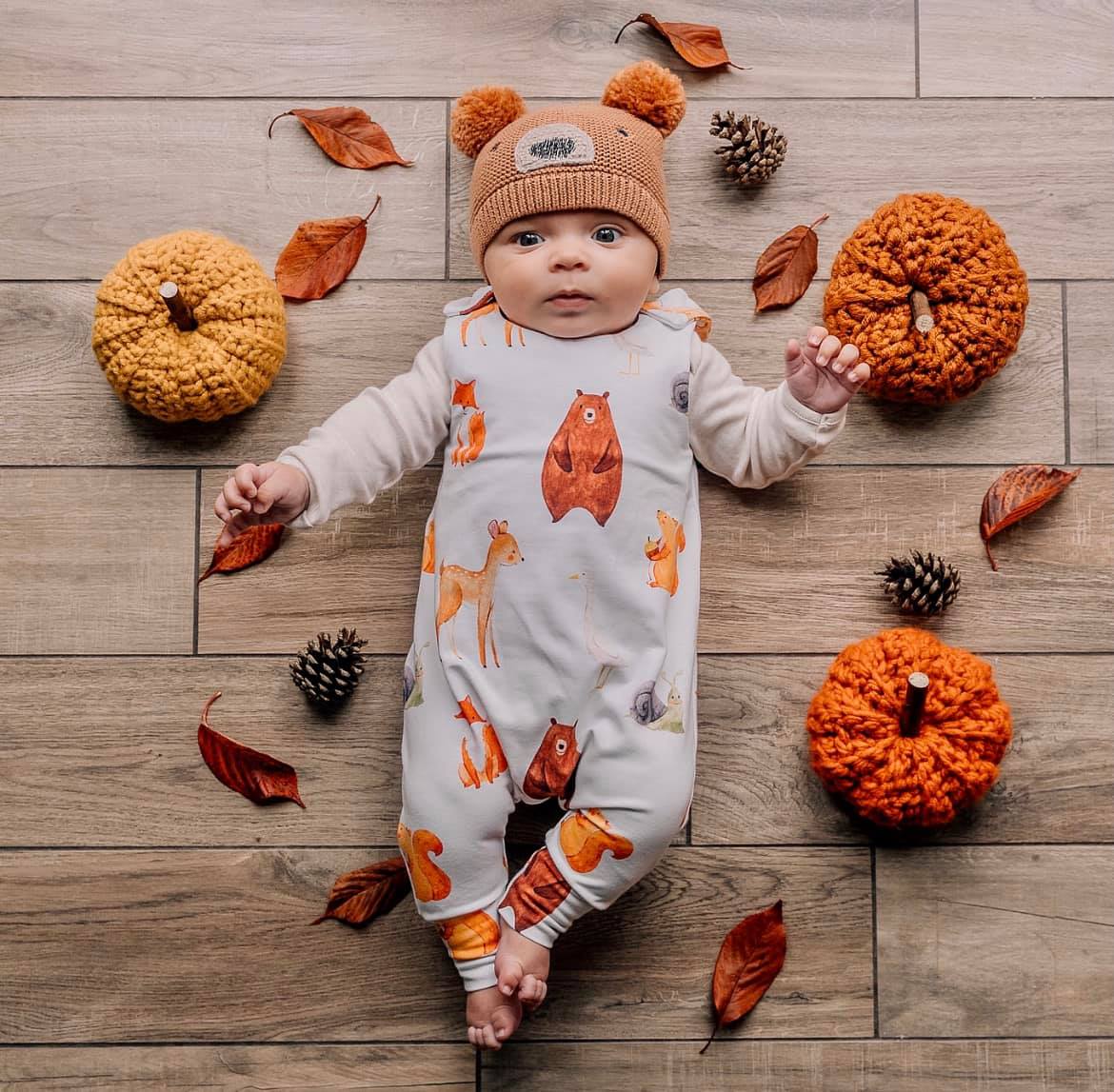
This one is an unusual 'flat lay' in that it's centred on a human and the objects provide the context and frame the subject. It's a brilliant idea especially with young babies who are not yet walking and involving them in a seasonal image. This is a photo by our grad Lucy Pritchard
5. Different stages of the same thing
A delicious looking pumpkin soup surrounded by actual pumpkins. Plus the child's hands to clarify the action and the story. We know where we are and how we got here.
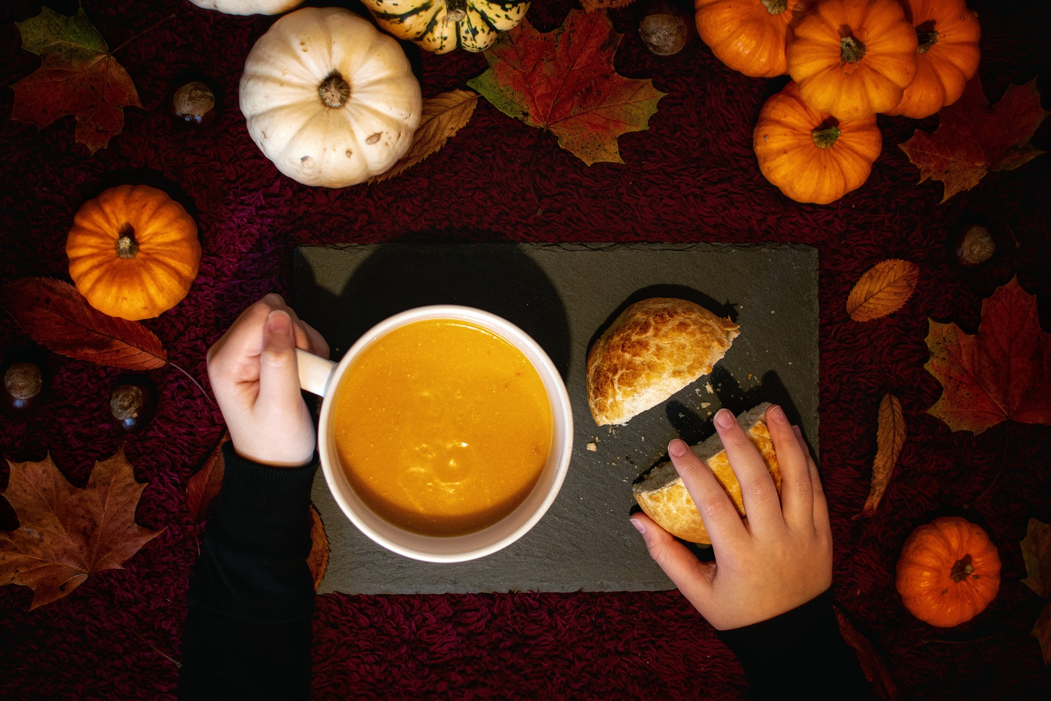
Photo by Kirsty Hampson
